A redesign was already in motion. I was asked what I would do differently
I was a designer on lavote.gov. The developers had a redesign direction in mind and my manager asked for my read on it. So I answered with a full proposal: an information architecture for the whole site, and five templates that show it working. The structural and content work I put forward was adopted; the design below is the proposal it came from.
My role: answer with a structure
I was one of the designers on lavote.gov, working at page and pattern level. The dev team already had a redesign in motion and I was asked what I'd do differently.
What actually reached production was the homepage grouping. Everything else here is the pitch. The “What changed” table marks which is which, row by row.
A redesign with no structure
I was one of the designers on lavote.gov, working page and pattern level.
The honest answer was that the disagreement was not about the surface. Re-skinning the homepage would have preserved the thing making it hard to use.
Nothing had ever been removed
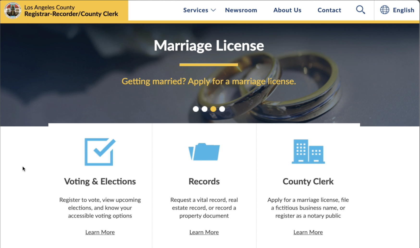
Working across the site meant auditing it constantly, and what that kept producing was structural evidence: years of pages, forms and links added without a structure to absorb them, under a visual system that had fallen behind the county's other digital properties.
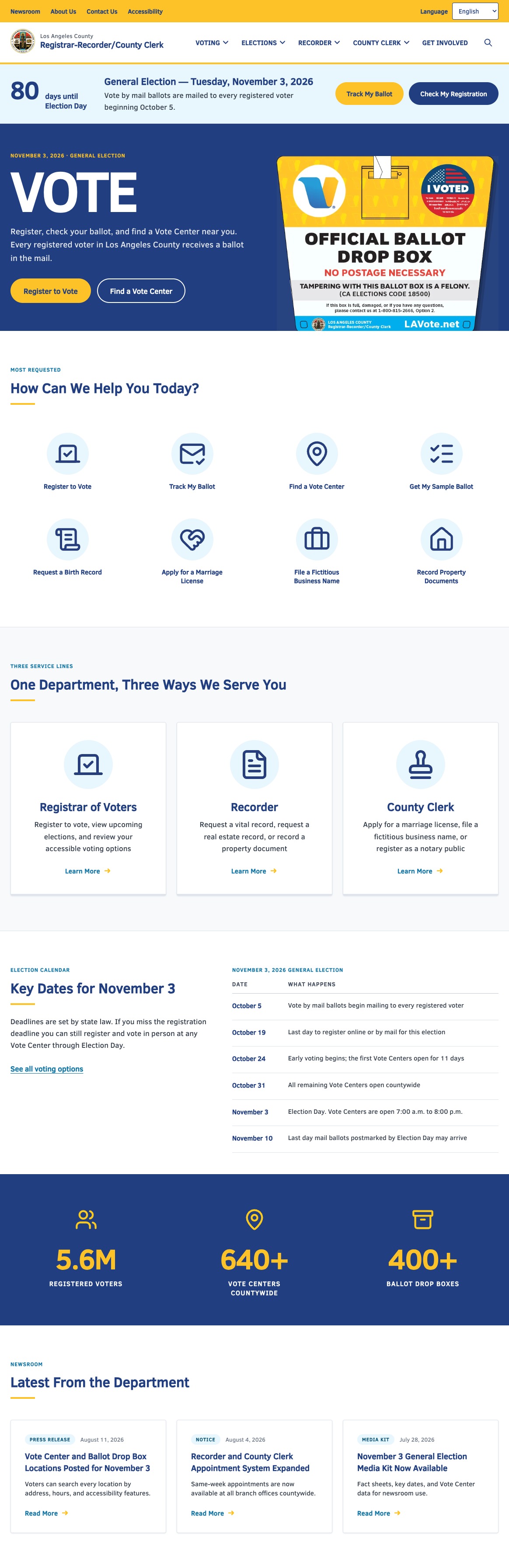
The homepage alone routed to a sixteen-button “Top Requests” grid sitting on top of a seven-tab primary nav. For a site that has to serve a first-time voter and someone requesting a decades-old marriage record with equal clarity, that density made the first decision the hardest one.
Nothing on that page was there by accident. Every button existed because someone, at some point, needed exactly that link, which is precisely why it had never been cut.
Three moves that decide where content lives
The department is one brand with three service lines, and the site had never been organised around them. That is the spine of the proposal: sections that match how the department actually works, a navigation built to hold the long tail, and landings that rank tasks instead of listing them.
None of these moves reduce what the site can do. They shift the burden off the homepage and onto the navigation and the section landings, which were built for it.
Standardising labels sounds like housekeeping, and it was the change that made any of it possible: you cannot group services into sections while the same service answers to three different names. Cutting redundant pages and rewriting legalese into plain language came with it.
The developers had built the Our Services module and were proud of it, and removing it was never on the table. So the proposal keeps it: the three service lines survive intact on every template. The eight most-requested tasks sit above it rather than replacing it, which turned out to be the better argument anyway: Our Services answers which part of the department, and the task tiles answer what am I here to do. Designing around the constraint separated two questions the old grid had collapsed into one.
Five templates, one structure
A homepage on its own proves nothing. The question was whether the three service lines hold up as a way to organise the whole site.
{{ shot.desc }}
Five sections, three levels
The templates only work if the map behind them does. The department is one brand with three service lines, so the map starts there.
Depth is capped at three levels. Anything that would sit at level four is a task, not a page, and belongs in the mega-menu or the accordion at the foot of its landing.
- Vote by Mail
- Voting in Person
- Interactive Sample Ballot
- Mobile Vote Center
- Flex Program
- Military & Overseas
- Voting Accessibility
- Current & Upcoming Elections
- Find My Election Information
- Election Results
- Certifying Results
- Public Observation
- Candidate & Measure Filing
- Election Resources
- Birth Records
- Death Records
- Marriage Records
- Property Document Recording
- Real Estate Records
- Military Discharge
- UCC Financing Statements
- Marriage Licenses & Ceremonies
- Fictitious Business Names
- Notary Public Oath & Bond
- Domestic Partnerships
- Professional Registrations
- Translation & Authentication
- Environmental Notices & Fees
- Become an Election Worker
- Community & Voter Outreach
- Voter Education
- Do Business with Us
- Volunteer Programs
Four colors, one typeface
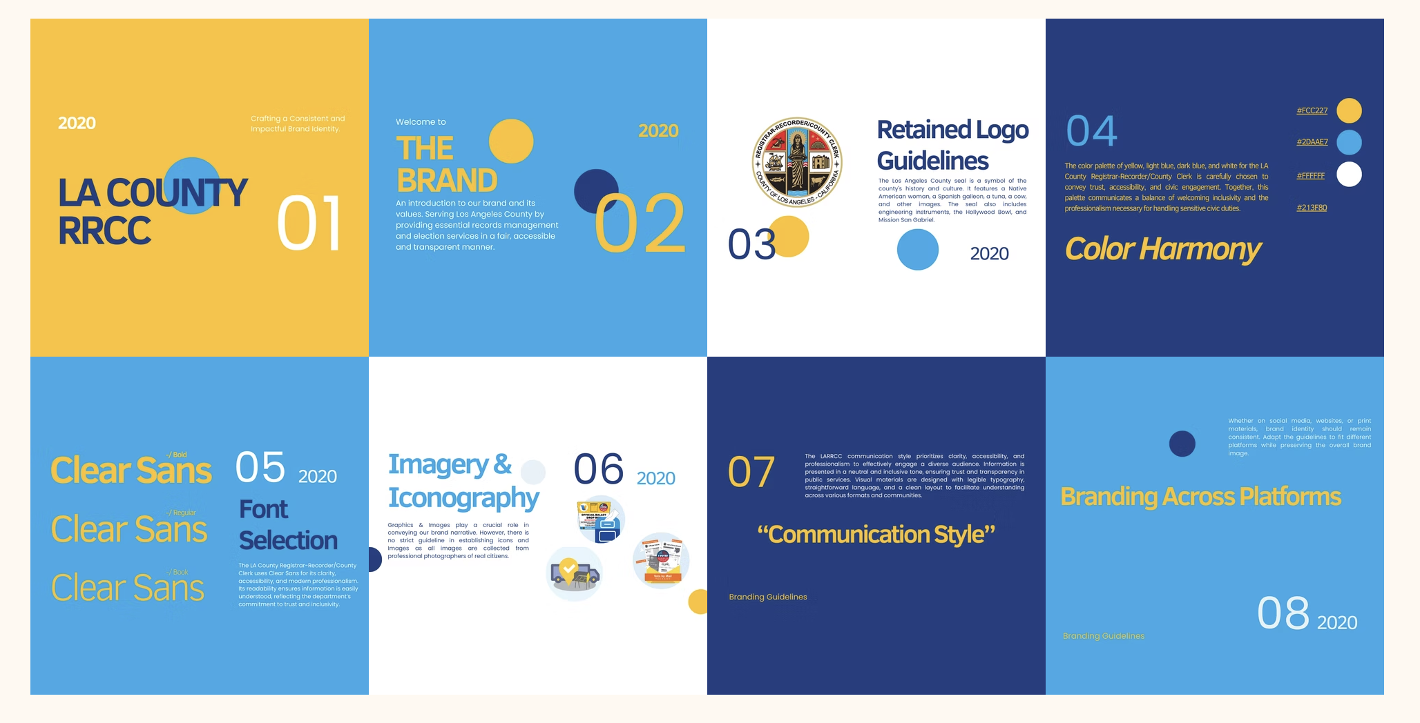
A deck settles what a brand looks like, not how it gets built, and a concept is only an argument until someone can build the next page from it. The department had a 2020 brand deck and a live site, but nothing in between.
The hardest part was not picking values. It was writing down proportion: white dominates, navy carries structure, light blue carries interaction, yellow is a spark.
Read the full brand kit →